When United GNOME theme first came out I didn’t write about it because in as much as it was inspired by a concept of Ubuntu 18.04’s now-scrapped Unity 8 desktop, it was more buggy than I could stand.
Thanks to a recent update, the theme has come to see many changes and UI tweaks which overall make it better than at its initial release. Now, I can tell you about it.
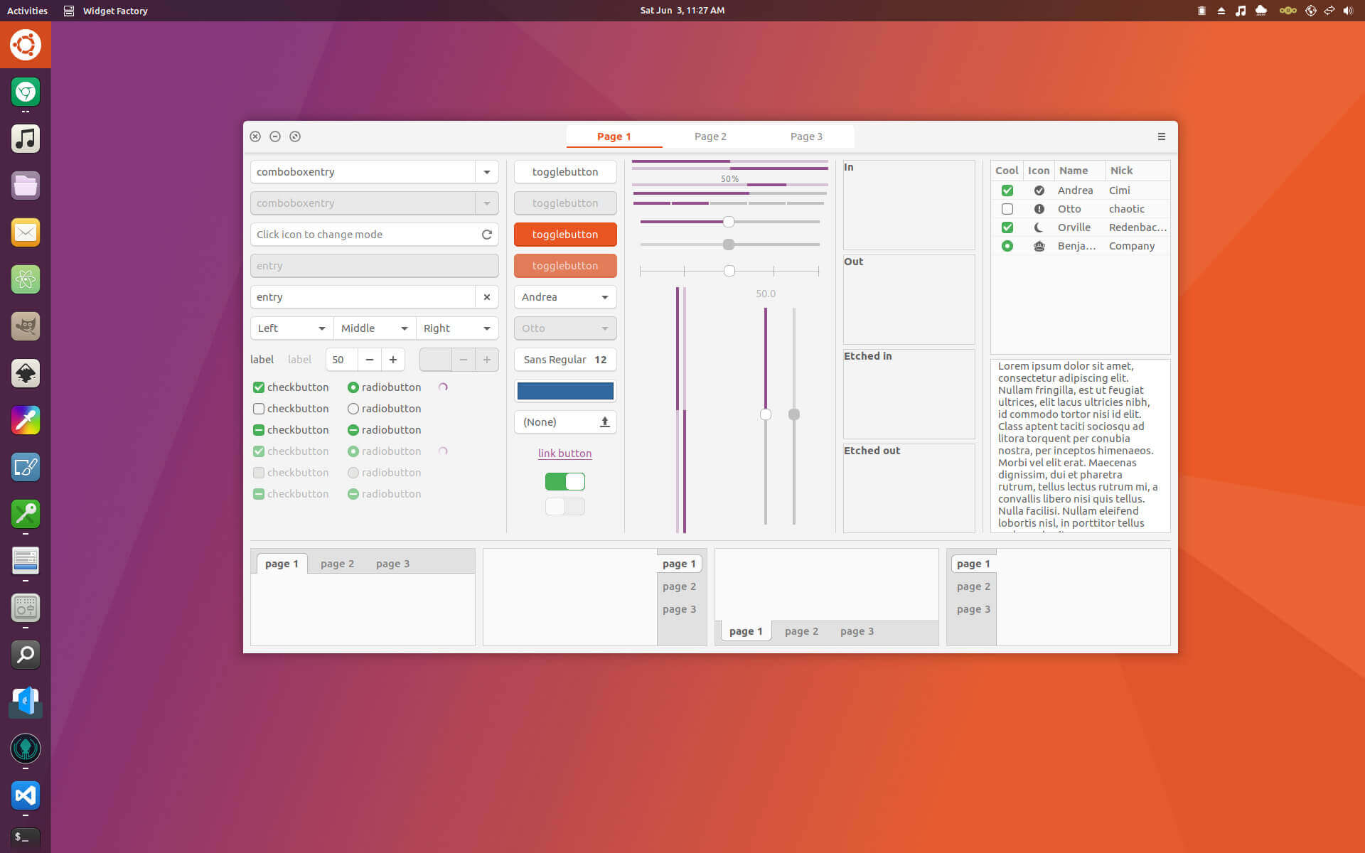
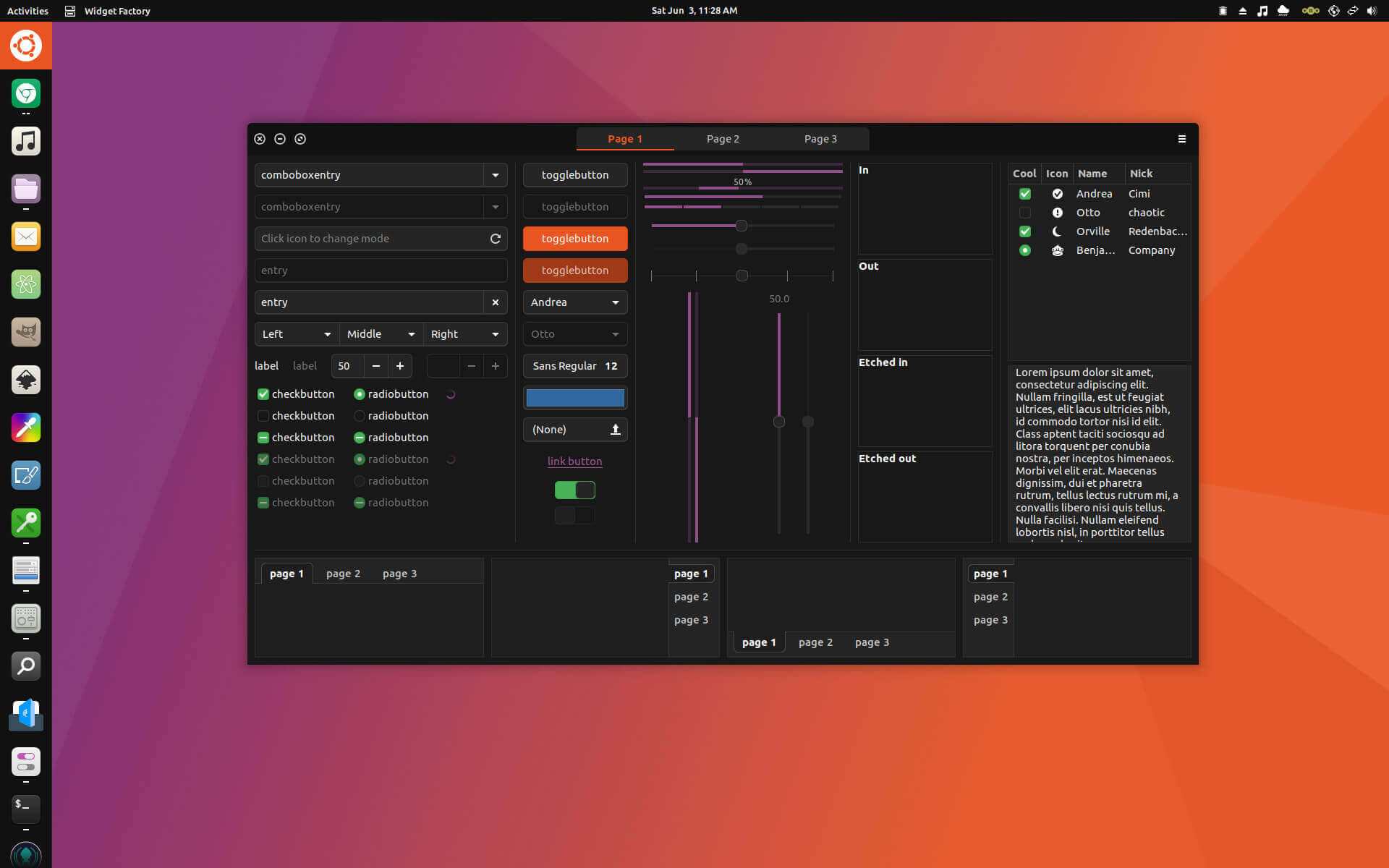
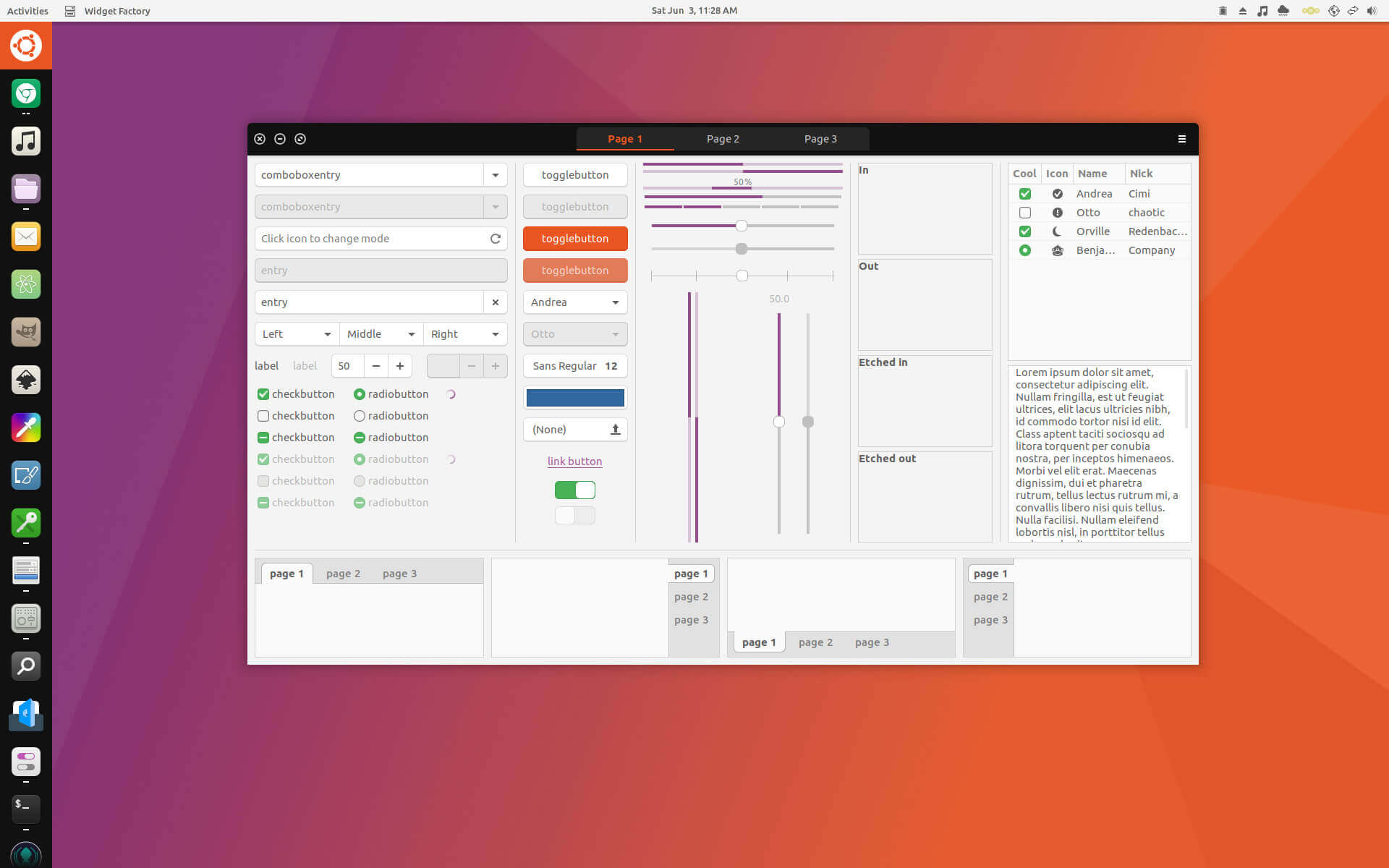
United GNOME is a GTK3 theme inspired by a Unity 8 design concept of Ubuntu 18.04 and the material design-inspired Flat-Plat theme.
Features in United GNOME
- 3 GNOME shell color schemes: transparent dark, opaque dark and opaque light.
- 3 GTK3 color schemes: light, dark and light with a dark title-bar similar to Unity 8.
- Support for Dash to Dock modified to give a Unity 7/8 launcher look.
United GNOME Previews


The theme was created by godlyranchdressings and is distributed under the terms of the GNU General Public License 3 or later.
Install United GNOME in Linux
United GNOME has no nifty means for installation yet which is disappointing, but as Linux users we are used to handling workarounds like this.
[mks_button size=”medium” title=”Download United GNOME” style=”squared” url=”https://github.com/godlyranchdressing/United-GNOME/releases/” target=”_blank” rel=”nofollow” bg_color=”#4E5080″ txt_color=”#fff” icon=”fa-download” icon_type=”fa” nofollow=”1″]
- Extract the downloaded archive and move the ‘United’ folders to
~/.themes - Apply the variant of your choice using GNOME Tweak Tool
- [Optional] – If you have the User Themes extension installed you can apply both the United GNOME GTK theme and the United GNOME theme for GNOME Shell.
What do you think about United GNOME theme? Is it sleek enough to make it to the list of your top 10 favorite themes for Linux? Share your thoughts in the comments section below.

linux community should stop making theme and DE but more focus in making apps instead